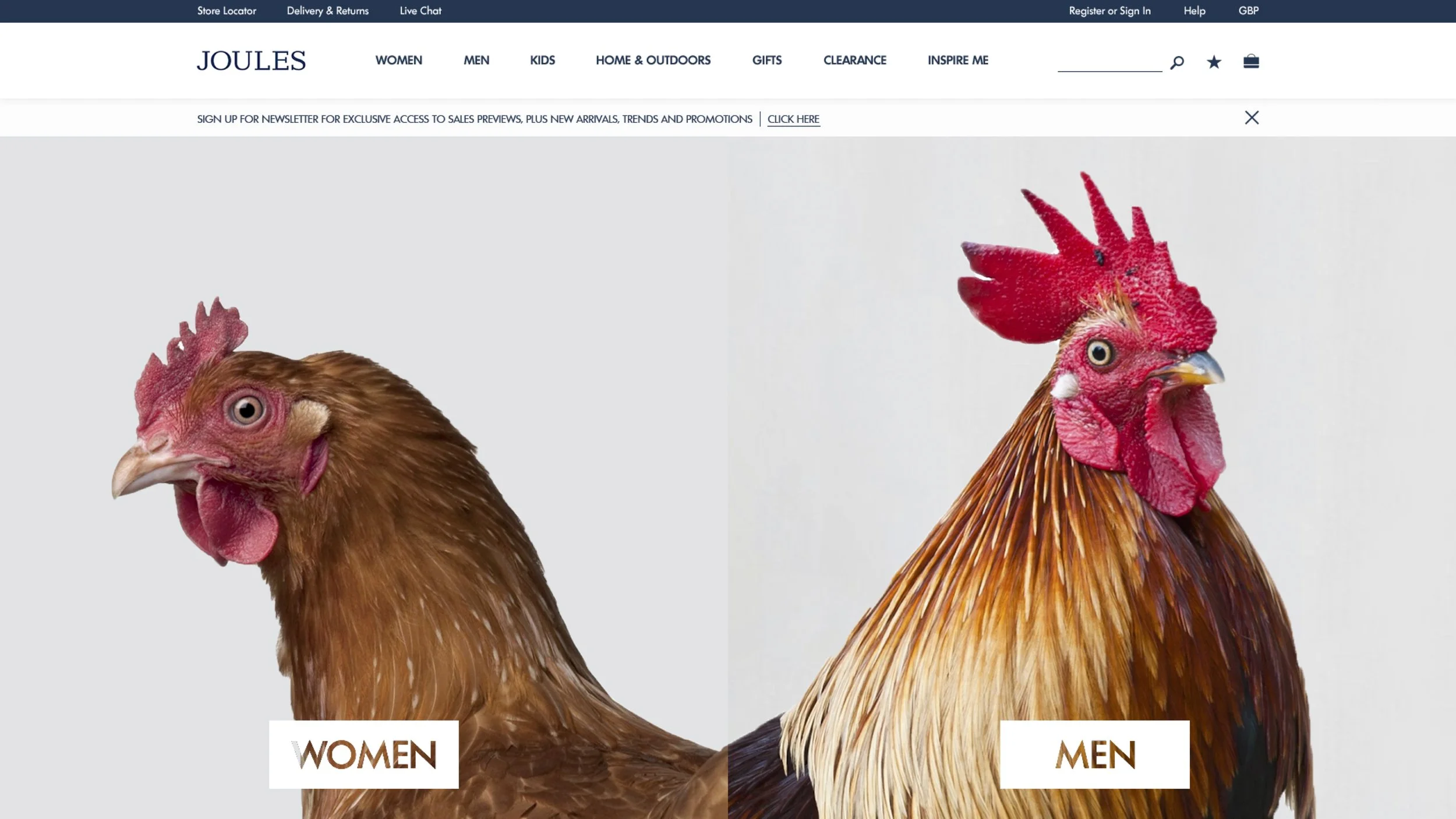
In 2016 we were asked to provide Joules, the much-celebrated fashion and homewares retailer, with a view on how they should refresh their online presence.
Our proposal comprised of five core recommendations, which we brought to life through some example design concepts:
Lean into the playful, fun, colourful and quirky side of the brand
Leverage the company’s connection with the british countryside, and the temperamental british weather, to show how the Joules product range covers all conditions, not just rainy days
Consolidate and defend the core family segment (with a focus on mums as the purchaser), then target older and younger audiences with different messaging and positioning
Stop the formulaic, cookie-cutter eCommerce best practice, and learn what’s right for you
Test and learn. Be sure to introduce new concepts, features and updates slowly over time to avoid disrupting the existing sales flow
BRAND | EXPERIENCE DESIGN | DIGITAL | CONTENT
Agency: Matter Of Form | Work: Pitch Only


